Wealth Management · Wells Fargo
Trust Services Dashboard: a personalized workspace for Relationship Managers and Ultra High Net Worth clients
The challenge
Relationship Managers and ultra-high-net-worth clients needed a single view into investment portfolios that were otherwise scattered across disconnected tools and reports. As part of Wells Fargo's Investment Fiduciary Services redesign, I led the UX strategy and design for a dashboard that could flex to how each Relationship Manager and client actually worked.
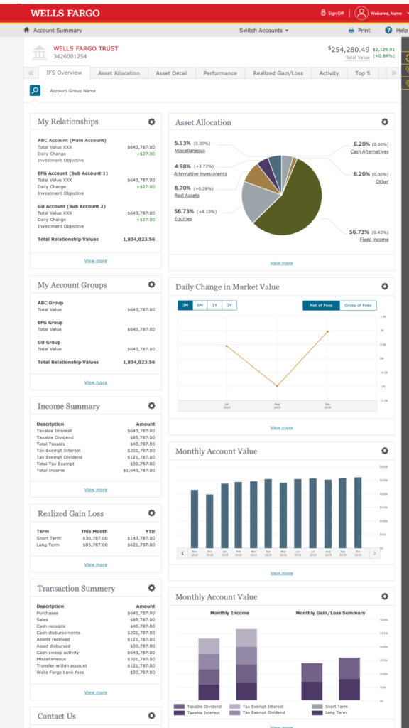
Full IFS Dashboard view: relationship, allocation, and performance tiles arranged in a personalized, rearrangeable layout.
The approach
I designed a workspace that let users aggregate key account information in one place, rearrange dashboard tiles through drag-and-drop, and tailor each view to a selected account group. It was one of the first highly personalized dashboard experiences built within Wells Fargo, which meant establishing new interaction patterns rather than adapting existing ones.
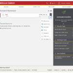
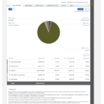
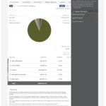
 Figma
 Jira
 Confluence
 iRise
A more intuitive, flexible, customer-centered experience that changed how clients monitored and managed their investments.
Why it mattered
Personalization at this level was new territory for a wealth management platform of this scale. The dashboard gave both RMs and clients control over what they saw and how, replacing a one-size-fits-all report view with a workspace people could actually shape around their own priorities.